
This article presents visualization processes that can be followed while working on an Automated Machine Learning (auto-ML) environment.
Abstract
Training a model on an auto-ML environment involves multiple techniques and algorithms, each of which has its own set of hyperparameters. The benchmarks on certain metrics and their corresponding visualizations can help to generate trust in the auto-ML modelling process.
Auto-ML platforms like Microsoft Azure, Google, and H2O provide a web interface to visualize and evaluate models. Another open-source platform, ATMSeer, provides an interface that lets users visualize the metrics and have some real-time control over the model search process.
Model and Feature Evaluation: Classification Models
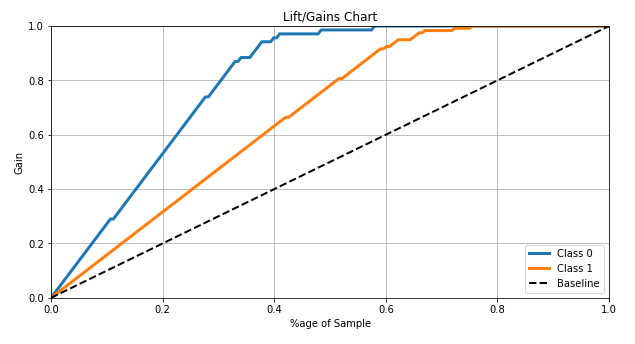
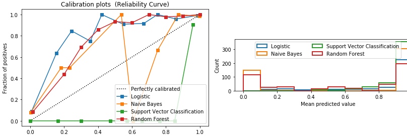
Comparing multiple models using metrics like confusion matrix, precision, recall, and lift is the common convention used by practitioners to rank algorithms (or hyperparameters within the same model).
Lift/Gain Chart: Compares the lift and gain of the automated models against a baseline model.
Calibration Chart: Visualizes confidence in predictions. The graph plots the relationship between the predicted probability and the actual probability.
Model and Feature Evaluation: Regression Models
Residual Evaluation: Residuals are the errors between the actual and predicted values. The distribution of residuals helps analyze if any trend was captured by the model.
Other graphs that can be used for interpretation include Predicted vs. Actual Plot and Visualization of Feature Importance.
Auto-ML platforms like Microsoft Azure, Google, and H2O provide a web interface to visualize and evaluate models. Another open-source platform, ATMSeer, provides an interface that lets users visualize the metrics and have some real-time control over the model search process.
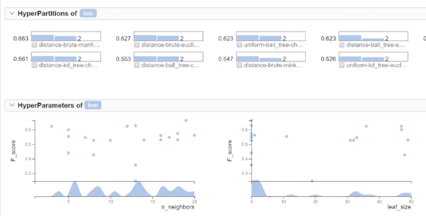
Sample Visualizations from ATMSeer
ATMSeer is an open-source platform that helps to increase the transparency and controllability of Automated Machine Learning.
The following visualization is a sample of ATMSeer’s output. The graphs show how the F-Value changes with different hyperparameter values (i.e. #neighbors and leaf-size for a KNN algorithm). ATMSeer provides a real-time comparison of multiple algorithms and techniques.
References
Technical articles are published from the Absolutdata Labs group, and hail from The Absolutdata Data Science Center of Excellence. These articles also appear in BrainWave, Absolutdata’s quarterly data science digest.